As the demand for cryptocurrency trading continues to grow, it’s important for platforms to offer a user-friendly and modern experience for their users. Our team was approached by a cryptocurrency trading platform to redesign their site in a way that would make it more intuitive and visually appealing for their users.


Objective
The main objective of this project was to create a more modern and intuitive design for the CRM part of cryptocurrency trading platform. This included updating the overall look and feel of the interface, as well as improving the usability of key features such as the dashboard, trading account, fund management, affiliate management, reports, and investment portal. Additionally, we wanted to ensure that the site was fully responsive for mobile devices.

Solution:
We began by conducting user research to understand the needs and pain points of the platform’s users. This included interviews, surveys, and usability testing results got from the customer and gathered feedback on the current design. Based on this research, we identified several key areas for improvement.

Dark Mode
We also focused on improving the usability of the dashboard, which is the central hub of the platform. We redesigned the layout to make it easier to access key features and added new widgets and visualizations to help users track their portfolios and make informed trading decisions.

Fully responsive
In addition to these changes, we redesigned the trading account, fund management, and affiliate management pages to make them more intuitive and user-friendly. We also introduced a referral system to encourage users to invite their friends and colleagues to the platform.
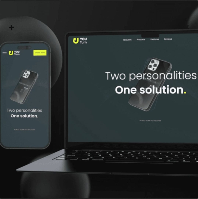
Finally, we made sure that the entire site was fully responsive for mobile devices. This was crucial, as many users access the platform on their smartphones and tablets

Results:
The redesigned cryptocurrency trading platform was well-received by users, with many praising the modern and intuitive design. Overall, we saw an improvement in user satisfaction and engagement, as well as a decrease in the number of support tickets related to usability issues.
The redesign of the cryptocurrency trading platform was a success and has helped to improve the user experience for traders. By modernizing the look and feel of the site and improving the usability of key features, we were able to create a more enjoyable and efficient experience for users.
The introduction of dark and light modes, as well as a referral system, added value for users and helped to drive growth for the platform. Finally, the responsive design ensured that users could access the site on any device, which is crucial in today’s mobile-first world.
We believe that every big deal starts with simple “Hello”


